
Introducing PEPPR: A Brand Built on Beautiful Tension.
Some brands are built around a product. The best ones are built around an idea. PEPPR, a hot sauce brand rooted in Eastern Mediterranean culture, is the latter. When the founders came to Trooper Creative, they had a clear vision: a brand that could carry the weight of Levantine history while feeling completely at home on a contemporary table. What followed was one of the most creatively rich projects the studio has taken on.
PEPPR needed a full brand system from the ground up. Identity, packaging, bottle design, photography direction, messaging. The through line across all of it: the tension between ancient and modern. Not a brand that nods to heritage as decoration, but one where that heritage is the foundation everything else is built on.
The Oldest mark in the Room
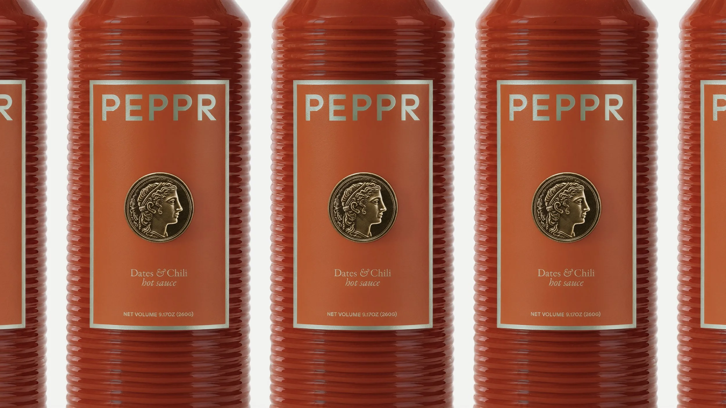
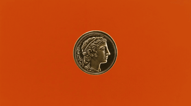
The centerpiece of the identity is a custom-designed coin, drawn from Eastern Mediterranean history and hand-crafted for PEPPR. It is an unconventional choice for a logo mark, and that is precisely the point. Coins are among the oldest designed objects in human history, carrying culture, power, and identity in the smallest possible form. Used here across the identity and packaging, the coin gives PEPPR a sense of permanence and provenance that a conventional logomark simply could not.

Etched in the Present
The wordmark was designed to feel etched, as though it had been pressed into stone centuries ago. But the typeface is unmistakably modern, creating a quiet friction that runs through the entire brand. You sense the age of it before you can explain why.
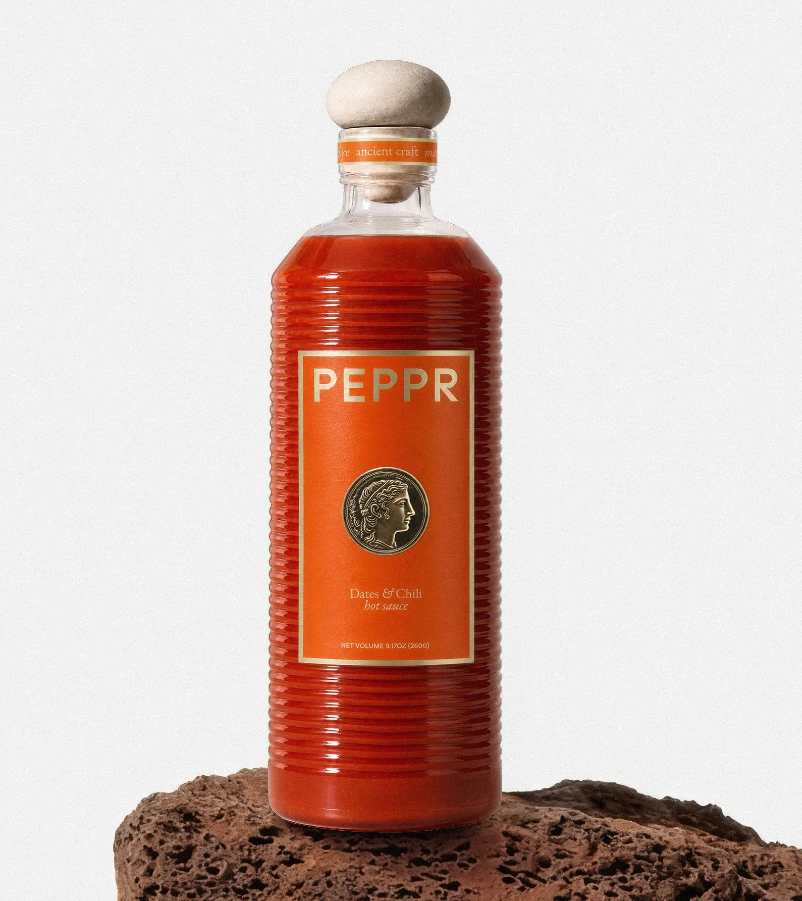
A Bottle Worth Keeping
The bottle was designed as an object in its own right. The form is unique, considered, and unapologetically luxurious. This is not a bottle you tuck into a cabinet. It is one you leave on the counter, on the table, on the shelf. The physicality of the product was treated with the same intention as the visual identity, because for a brand like PEPPR, the object is part of the story.
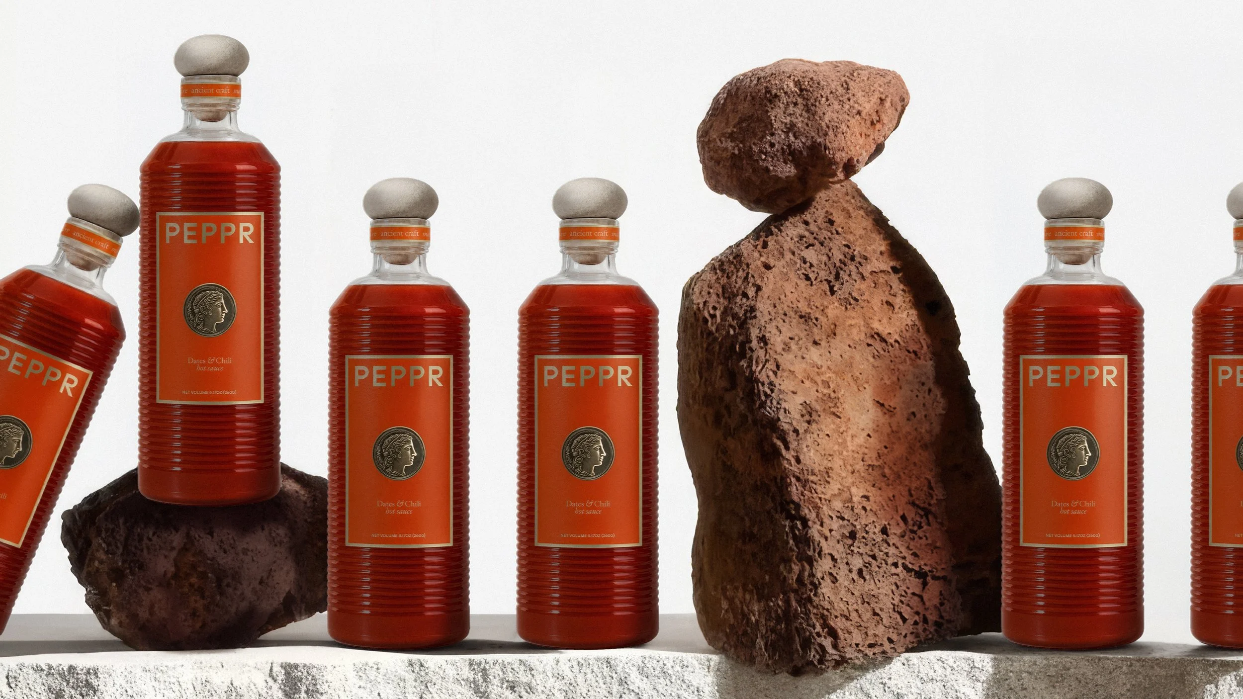
Stone and Color
The art direction pairs raw stone surfaces with bright, saturated color. Stone as a reference to history, depth, and permanence. Color as a signal of vitality and contemporary appetite. Together they create imagery that feels both timeless and immediate, which is exactly where PEPPR lives.
Words That Know Where They Come From
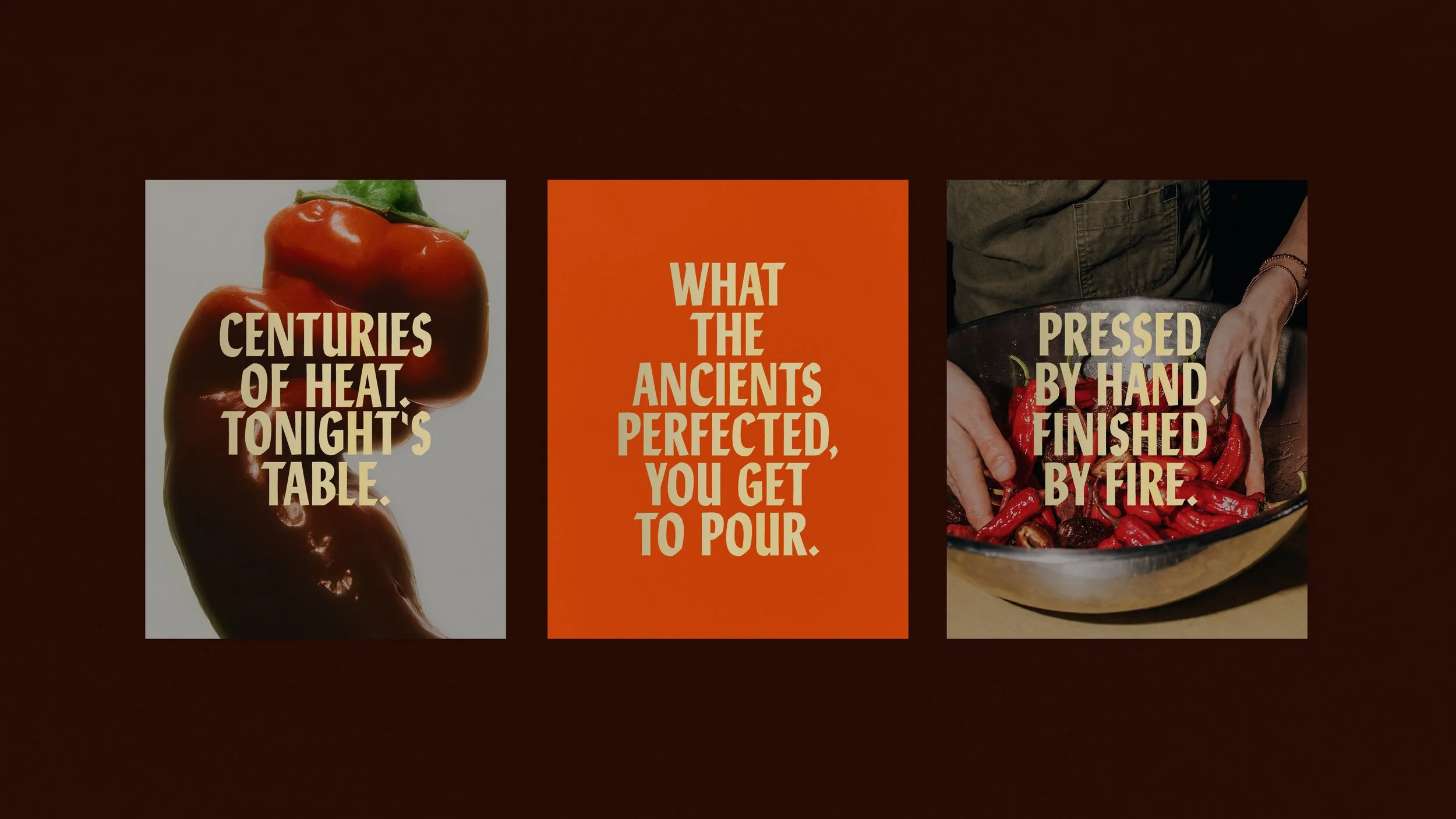
The copy was written around the same tension. Ancient in reference, direct in delivery. The brand speaks with the confidence of something that has existed for a long time and does not need to explain itself. Taglines like "Where Tradition Simmers" and "Ancient Craft. Modern Heat." are not just clever lines. They are the brand's worldview, compressed.
A Brand That Knows Itself
PEPPR launches as a complete brand: a visual system, a physical product, and a voice that all pull in the same direction. It is a brand that knows exactly where it came from, and is completely uninterested in staying there.